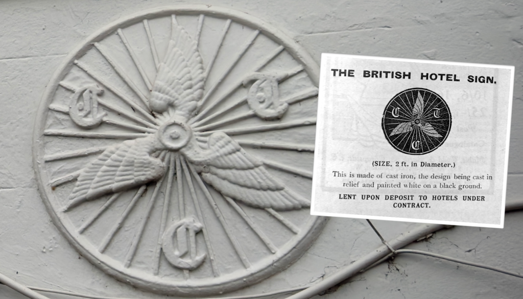
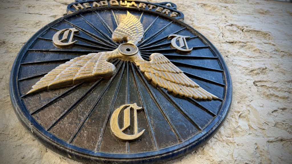
Cast from iron, embossed into copper, fashioned from silver, and printed on paper, the iconic “winged wheel” motif was the protected trade mark of the CTC, or Cyclists’ Touring Club. This protection was shamelessly applied because the three-wing design, introduced in 1886, was a clear and obvious copy of another club’s logo.
The Cyclists’ Touring Club was founded as the Bicycle Touring Club at the North of England Meet of high-wheel riders held on the Stray at Harrogate on August 5th, 1878.
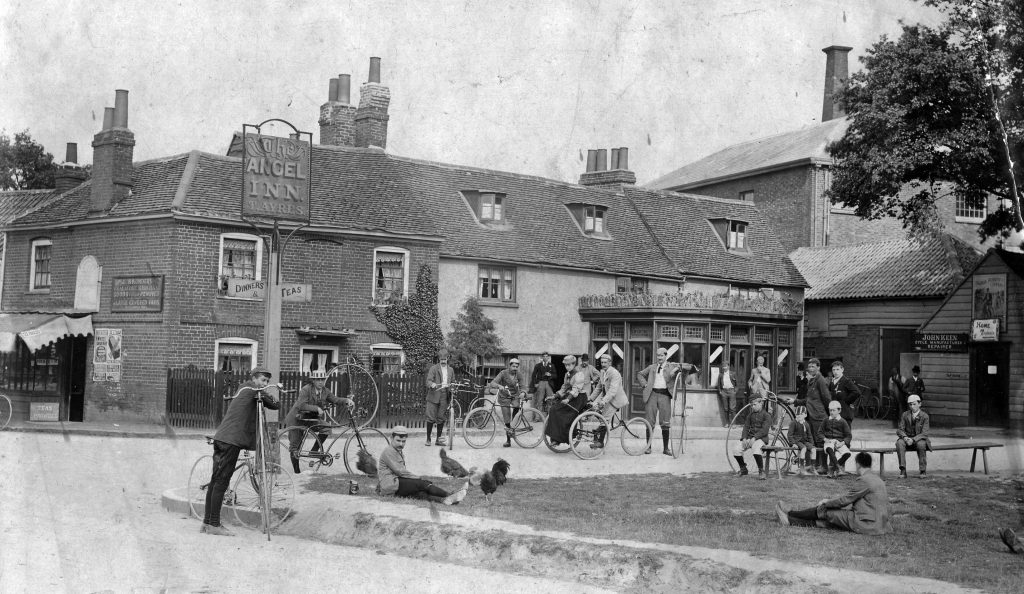
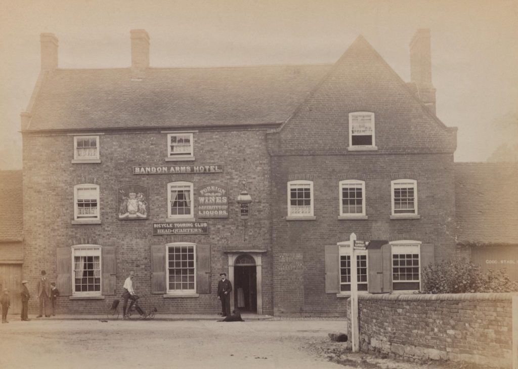
One of the early aims of the BTC was to “secure and appoint at fixed and reduced rates hotel headquarters in all parts of the country.”
These hotels were often rural coaching inns that, because of the advent of train travel, were usually down on their luck. Many were saved by the new and welcome custom from cyclists. These pioneers were often young, athletic, wealthy and time-rich. Their bicycles were rare, valuable and avant-garde. The exploits of these trailblazers is fondly described in a history of the CTC, written in 1928 by James Thomas Lightwood, himself a pioneer:
“No sooner had the bicycle become recognized as a new means of progress in this country than those who possessed them experienced a longing to get away from towns and streets and explore the countryside. This joy of the open road was a new experience, giving all the charm of novelty mingled with a spice of adventure and a modicum of risk … Those were the days of great adventure, and the first impulse of those who mastered the art of riding the bicycle was to go forth on voyages of discovery into the Great Unknown.”
The “Great Unknown” is perhaps over-egging it but those early cyclists were among the first travellers in a generation to set out to explore Britain via its neglected trunk-road network. After most long-distance transport migrated to the rail network, road travel withered. The formerly busy coaching inns came to life again as watering holes for those two- and three-wheelers on day cycle tours from the cities, or who rode from town to town on long-distance rural tours.
Tribes
Branding was an important part of early cycling club culture and identity. Official colours, uniforms and badges gave members a sense of belonging. Most Victorian cycling clubs had insignias, often including club initials.
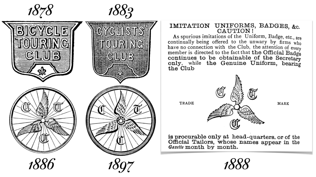
For their first badge after their founding in 1878 the BTC created a “small silver shield with the letters B.T.C on a diagonal line.” This badge evolved into a larger shield with the club name written out in full. The badge was manufactured by Marsten, a Birmingham jeweller. Special badges were made for consuls and councillors, some in red or blue enamel. The new logo also appeared on the club’s letterhead and the masthead of club journal, The BTC Gazette.
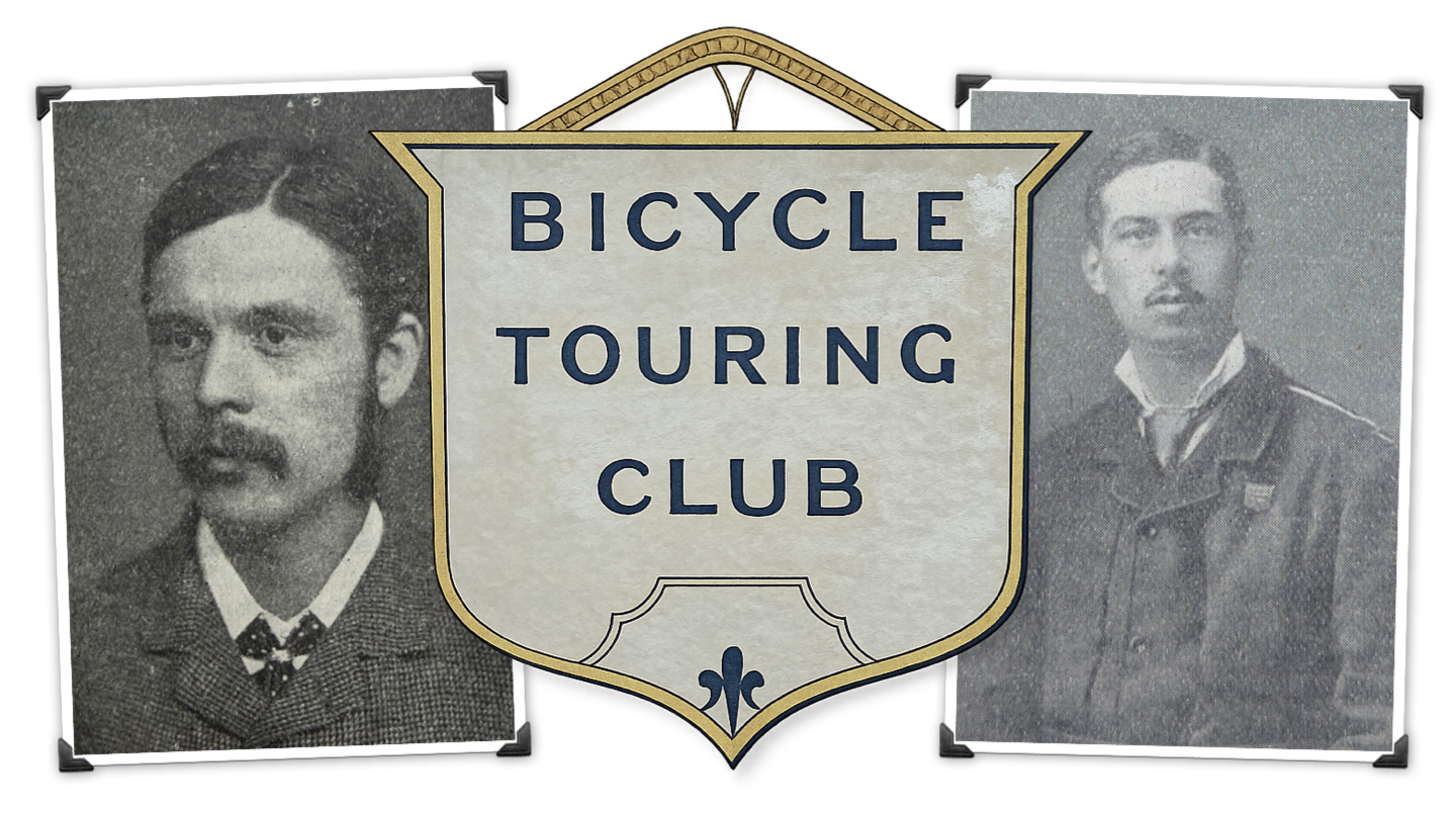
In 1883, the BTC rebranded itself the Cyclists’ Touring Club to accommodate tricyclists. The original shield badge was retained with the club name updated. By 1885 a redesign was in order. Robert E. Phillips, a CTC councillor and life member (and author of The Cyclists’ Pocket Road Guides), set to work.
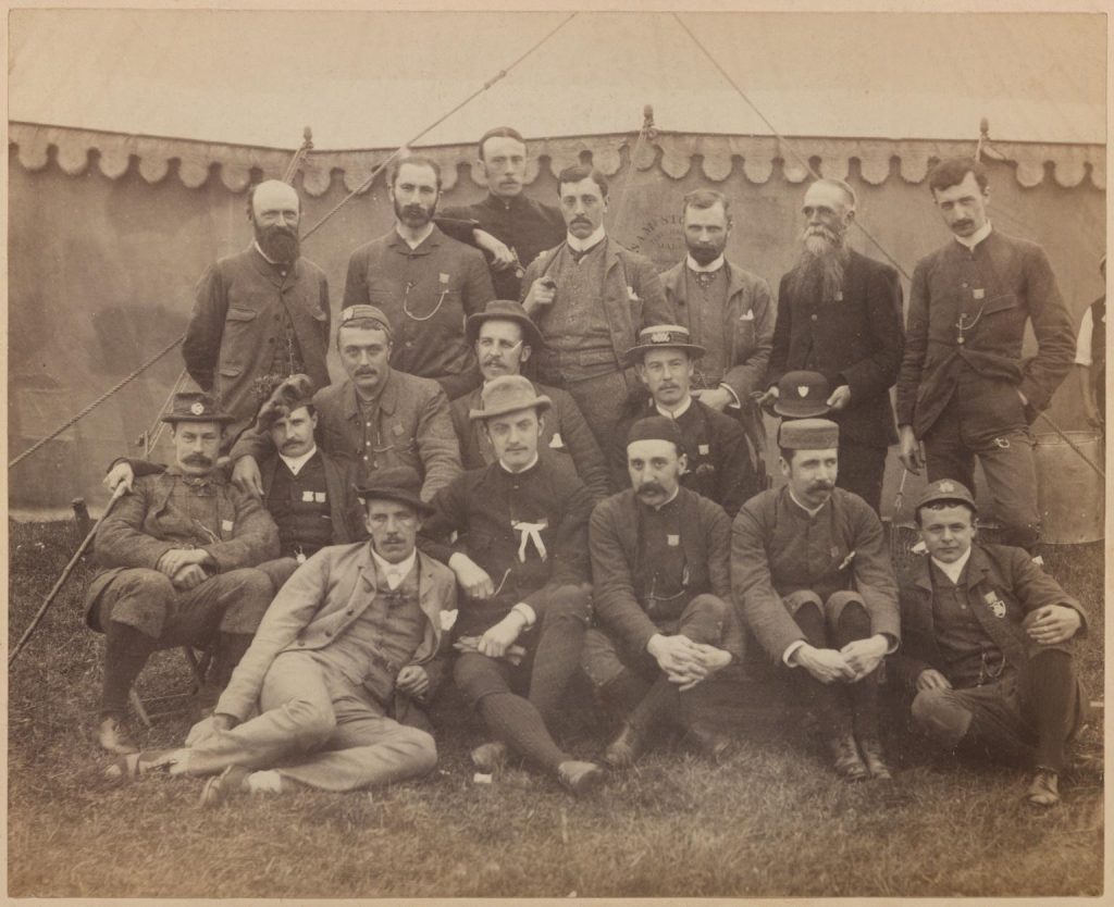
The following year the winged wheel design was launched in the CTC Gazette. It featured three wings joined at the hub of a bicycle wheel and was inset with the club’s initials in a faux medieval typeface. To anybody familiar with the League of American Wheelmen, America’s younger equivalent to the CTC, the logo was a close copy of the LAW logo, designed in 1881 and in widespread use by 1882.
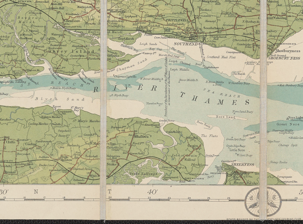
And many people certainly would have been familiar with LAW’s logo because from the earliest days of cycling many British cyclists toured in America and many American cyclists toured in Britain. Cycling literature from both sides of the Atlantic was also widely distributed in each country, and hundreds of CTC members were LAW members and vice versa. More on the shameless plagiarism in a moment.
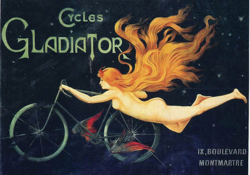
Cycling as flying
Why wings on the logo? “Bicycling…is the nearest approximation I know to the flight of birds,” wrote birdwatching author Louis J Halle in 1947. “There are movements on a bicycle corresponding to almost all the variations in the flight of the larger birds,” he continued.
Halle wasn’t the first to make the connection. Indeed, riding a bicycle was likened to flying from the earliest days of cycling. The first velocipedes of the early 1800s were compared to Pegasus, the flying stallion of Greek mythology, and — when pedals were added in the 1860s — riders of these faster cycles celebrated them as “flying steeds.”
“O bird, see; see, bird, I fly!” wrote American poet Henry Charles Beeching in his 1892 poem “Going down Hill on a Bicycle,” adding that “Who climbs with toil, wheresoe’er/Shall find wings waiting there.”
James Howard Means, editor of The Aeronautical Annual, wrote in an 1896 article that it was “not uncommon for the cyclist … to remark, Wheeling is just like flying!”
When designing the first heavier-than-air aircraft the Wright brothers — retailers of upmarket bicycles in their hometown of Dayton, Ohio (they gave up their bike shop in 1904, the year after taking to the air) — used their knowledge of cycling in their experiments.
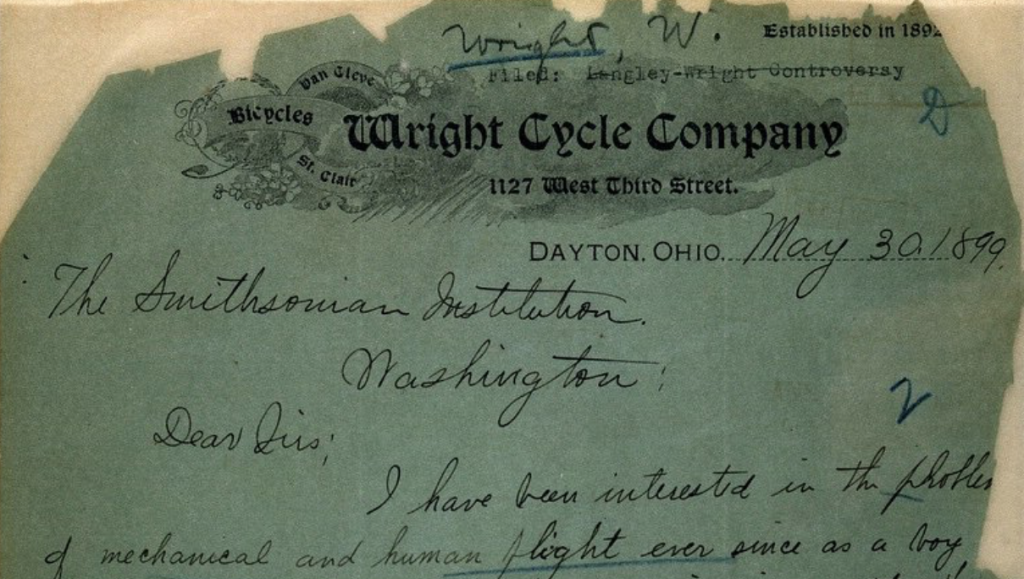
In 1899, Wilbur used a letterhead from the Wright Cycle Company when writing to the Smithsonian stating that he believed that human flight was possible, declaring his intent to pursue research in the field, and asking for publications on the subject. He was still writing on Wright Cycle Company letterheaded paper in 1904. (The shop’s own-brand Van Cleve and St. Clair bicycles were boutique offerings, fancier and more costly than bicycles from mass-market marques.)
Wilbur’s visionary wing warping technique of controlling an aircraft’s pitch, roll and yaw was developed in 1899 after twisting an empty bicycle tube box with the ends removed. Wing warping is still used today, albeit with ailerons.
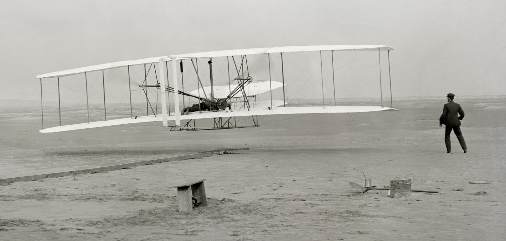
The Wright Brothers had used one of their bicycles to work out their ideal wing shape. The brothers took turns pedalling their converted machine. A handlebar-mounted wheel was fitted with two metal plates, one flat, one curved, ninety degrees apart. Orville and Wilbur used the device to measure air resistance.
“The results obtained with the rough apparatus…gave evidence of such possibility of exactness,” wrote Wilbur.
Badge
To symbolise swift transport and progress, several early cycle brands in the 1870s and 1880s married wheels with wings but the practice is much older than this with both ancient Greeks and Romans using winged wheels in art and on monuments. The symbol was associated with the Greek god Hermes and his equivalent, the Roman god Mercury. Period print advertisements from the American cycle maker William M. Wright (no relation to the Wright brothers of Dayton) featured Hermes/Mercury straddling a wheel with his magical winged sandals, while in March 1881 the Chicago Bicycle Club’s Edwin Lee designed a fussy club badge featuring triskelion-style lower legs spinning around the outside of a cartwheel. The triskelion symbol of three spinning legs, with or without wings, is an ancient motif and can be found today in the flags of the Isle of Man and Sicily, and there’s a stylised version on the seal of the US Department for Transportation.
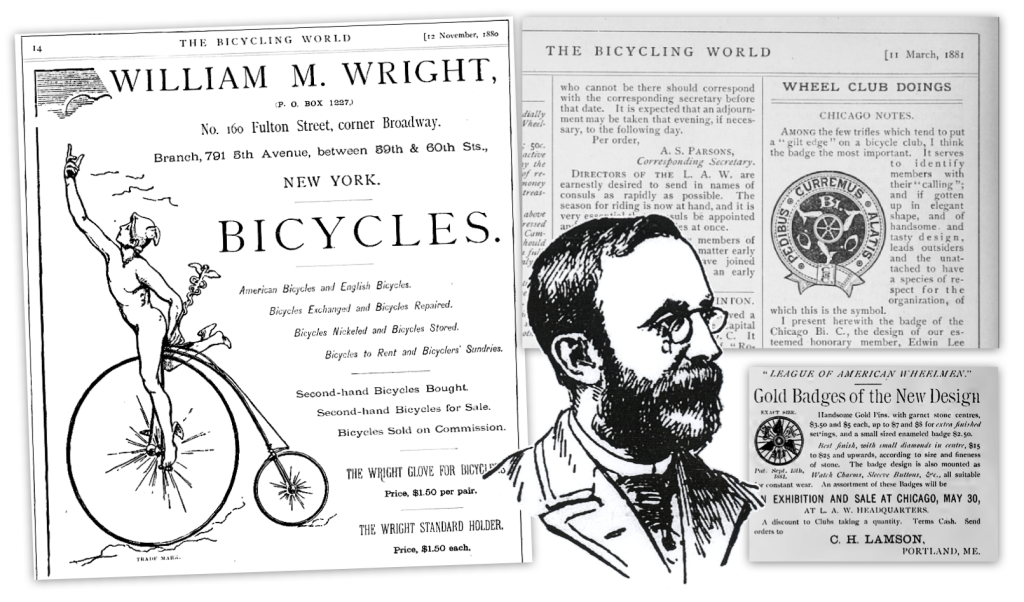
It’s possible that Lee’s triskeles design inspired the winged wheel design of the League of American Wheelmen (LAW, founded on 30th May, 1880 in Newport, Rhode Island, and now known as the League of American Bicyclists).
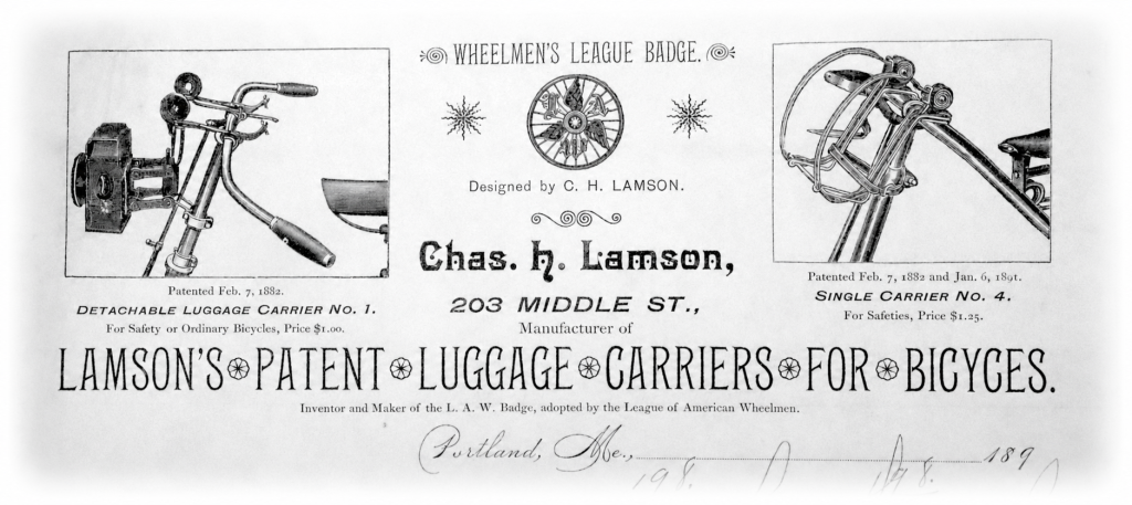
LAW’s logo was designed by jeweller Joseph H. Lamson of Portland, Maine. Lamson was an early high-wheel rider and official of the League of American Wheelmen (he was a LAW director, later known as a chief consul). He was tasked by LAW president Charles Pratt to craft a tiny badge “much as the Free Masons wear a square and compass,” reported a period account. Featuring the faux Gothic letters “L,” “A” and “W” beside three wings atop a solid-tyred bicycle wheel, this badge — originally meant to be worn as a lapel pin — was adopted by LAW officials at a business meeting of the League at the Metropolitan Hotel, New York on October 6th 1881. It was reported that Lamson’s design for the pin consisted of “a small gold suspension wheel, with three gold wings and the letters L. A. W. fastened to the outside of the wheel. In the center is a small stone or diamond.” (The Wheel, 12 October 1881.)
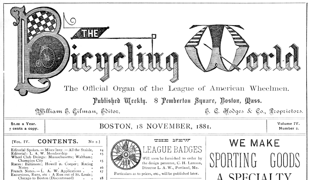
Why the Gothic, “blackletter” typeface? Given that cycles were at the cutting edge of modernity in the 1870s through to the “bicycle boom” of the mid-1890s (a third of all patent applications in the 1890s were bicycle related) it might be considered odd to us that Lamson chose a seemingly backwards-looking medieval typeface for his LAW logo. However, as a touring cyclist he typically would have had a romanticised view of history, with many of the pedalling pioneers believing themselves to be harking back to a golden age of pre-railway travel by road. Victorians also obsessed over medieval architecture and chivalric romances which, in part, spawned the Arts and Crafts movement, proponents of which often used blackletter. Period publications of all genres on both sides of the Atlantic were awash with the typeface, and its imposing presence also looked “official” giving any new organisation off-the-shelf gravitas.
Lamson’s pin was said to be “very neat, handsome and appropriate” and “will probably be approved of by those who care to wear an outward and visible sign of club membership.” He filed his design patent on May 9th 1881 and it was granted for seven years on September 13th of that year.
By January of the following year Lamson’s tri-wing logo was enlarged and positioned on stationery available for League members to purchase. By March, and the next business meeting of the league, an expanded version of the tiny badge became the club’s official logo. “In return for the League having the sole right to issue without royalty a standard size of silver badge of the new design,” said a period report, “the patentee should retain the exclusive right to make and sell them in gold, and also a small size in silver.” (Some early uses of the motif on club literature featured a precious stone in the middle of the wheel.)
There appeared to be no conflict-of-interest concerns that Lamson, a club official, would profit from sales of these expensive pins. At a national meet of LAW members in May 1882, Lamson “had a show-case, which were displayed all varieties of the League badges, from the $75.00 diamond, to the $7.50 ruby, or even the $3.50 garet; and he was surrounded by an admiring and purchasing throng, very few Leaguemen leaving Chicago without the badge-pin.” (The Wheelman, 1 November 1882.)
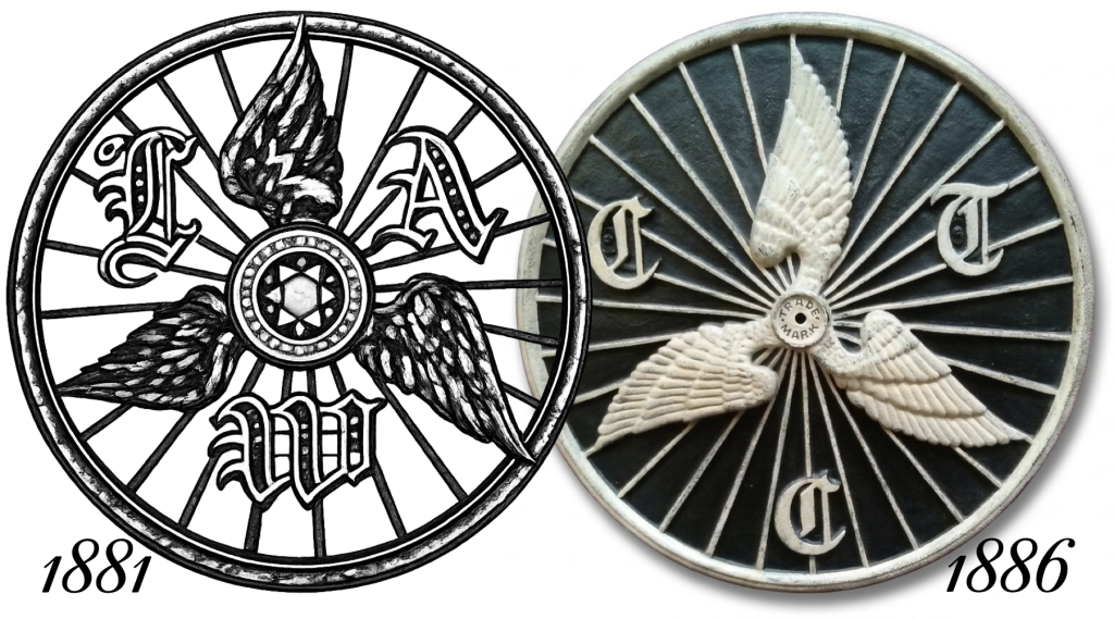
In 1881, the League of American Wheelmen had about 1,000 members which was a quarter of the size of the Cyclists’ Touring Club at the time. In 1885, the CTC’s membership ballooned to 20,385 and the LAW’s had risen to 4,749 members. LAW’s membership rose to 103,000 members by 1898, including some of the richest men of the day, such as oil magnate John D. Rockefeller. But before this rise the CTC was considered the senior of the two organisations so it’s surprising that, when in 1885 CTC councillor Phillips was tasked with finding a new logo for the club he spent some months on the task and yet, when he delivered the final design, it was an almost exact copy of LAW’s logo.
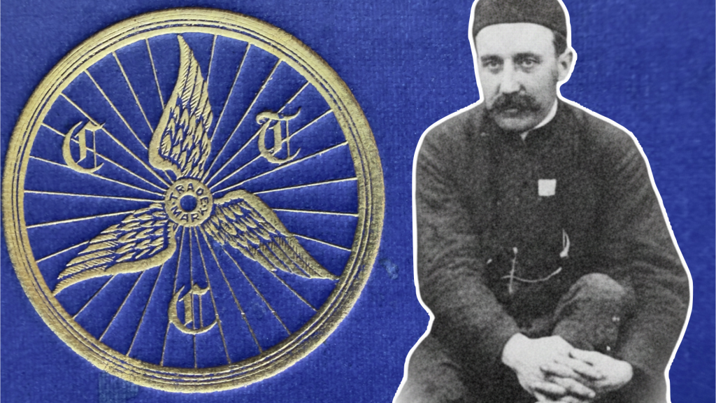
“To R. E. Phillips, a former Councillor, and a life member of the C.T.C., is due the entire credit for the design of the now famous ‘Wheel and Wings,'” claimed an official club history in 1928.
“One of the greatest compliments ever paid to the excellence of the [LAW] design is that after two years investigation,” snarked a period American account, “the Cyclist Touring Club of England [sic] … could do no better than appropriate the American design, substituting the initials, C. T. C. in place of L. A. W., and this in 1886, nearly five years after the date of its origination in the United States.” Ouch.
As early as 1882 the Bicycle Touring Club had been discussing the placement of “legal insignia” on hotels. “Several of our Consuls have generously come forward and offered to supply the Hotels in their locality with the needful official badge as soon as it is ready,” stated the BTC’s Monthly Circular and Official Gazette in November 1882.
“It is of course a moot point as to whether the sign shall be lent or sold outright; the former is undoubtedly the only way in which a check can be kept upon the hotel proprietor who from any cause may cease to be a contracting party with the Club, but,” continued the BTC official, “the question comes, will the finances admit of the investment of a sum of money large enough to provide the legal insignia for each hostelry?”
The signs would be expensive to produce because the official said BTC was considering an “enamel iron placard” that would be a “facsimile of the Club badge either by itself or inside a Wheel.”
Nothing came of these plans and it wasn’t until two years after the introduction of the “winged wheel” motif in 1886 that hotel signs were again discussed.
“It is an open secret that the Club is pledged to supply hotel headquarters, repairers, and others with a distinctive sign as a guarantee of official appointment,” stated an editorial in CTC Monthly Gazette, February 1888.
“The sign to be so adopted will probably take the shape of the badge magnified to a diameter of about 2ft., and reproduced in metal or some other suitable material. The committee commissioned to carry out the work will be glad to hear from any members who may know of business houses likely to tender for the supply of these articles in iron or any other durable and not too costly material.”
The CTC duly found a supplier of the 2-ft-wide, 60lb (27kg) discs and they were shipped to inns, hotels and repairers around the country from the end of 1888.
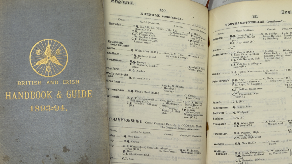
The BTC/CTC had been recommending inns, hotels and repairers to its members since the start of the club. Details were published annually in a detailed Handbook that was produced, under varying titles, from 1879 to 2000.
Explaining how a CTC member would use the club’s 1887 Handbook, CTC secretary and Gazette editor Ernest Shipton wrote:
“Supposing a man to be riding into Birmingham, and desirous of knowing what arrangements have been made for his comfort, he turns to the index in the Handbook, and then referring to the page on which Birmingham appears, he finds that the Grand Hotel is the head-quarters, while the local Consuls are Messrs. W. E. Adlard, 36, Moor Street, and C. N. Milner, 122, Lozells Road, and the official repairer is F. W. Ticehurst, Edmund Street. These several parties are theoretically always on the [lookout] to aid him and to minister to his comfort, and in this respect practice and theory are seldom far asunder.” (CTC Gazette, Marh 1887.)
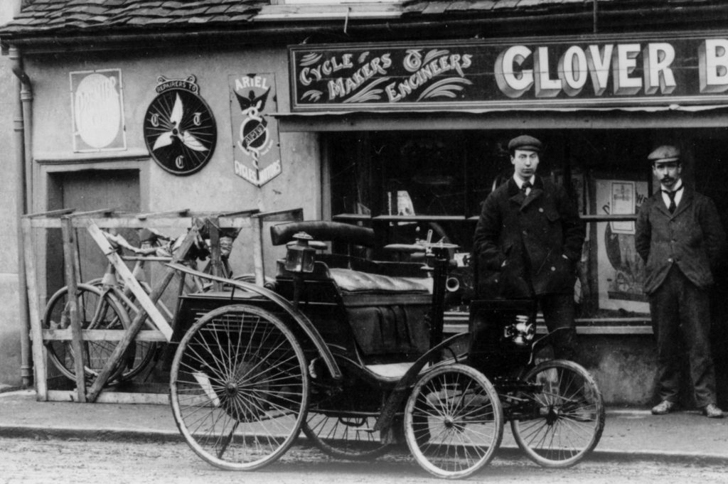
The Handbooks of the time don’t mention which establishments were supplied with the cast iron signs — loaned for a deposit of a Guinea (roughly £80 in today’s money) — and while inns and hotels and repairers were often scrubbed from the annual listings, with new recommendations slotting in, there’s no record of the CTC ever seeking to reclaim its property.
Sixteen-inch square enamel signs were issued to “approved caterers” for 12s. 6d. for “10 years hire fee,” said the CTC Handbook of 1952. Again, there’s no evidence any establishment was required to take down these signs either after falling out of favour with the CTC or when the ten year hire period was up.

For several years from 2002, CTC operated a self-certified “Cyclists Welcome” scheme, publishing the Cyclists Welcome accommodation, refreshment and services guide. Cooperating businesses could affix plastic stickers in windows. In a March 2003 snapshot of the CTC website there’s the odd claim that the “online and hard copy accommodation, refreshment and services guide” was the “first opportunity rural businesses have had to advertise their services to visiting cyclists in a nationwide publication.” Odd because the club had been producing exactly such a guide since 1879.
When, in 2016, the public-facing side of the CTC was changed to Cycling UK, the Cyclists Welcome scheme was updated with the new organisation’s name and logo. Until relatively recently the Cycling UK website had an online-only directory of recommended refreshment stops. However, this, like the Cyclists Welcome scheme, is now no longer operational.
It remains remarkable that 150 or so cast iron signs and enamel plaques have survived for so long on buildings around the country. They should be treasured.
WARNING SIGNS
Road markers, signposts and milestones have long been a feature of British roads but the first warning signs were erected for the safety of cyclists. High-wheeler cyclists required timely warnings because once they started on a descent they couldn’t easily stop. The pedals were “fixed” to the hub on the large wheel – “freewheeling” had yet to be invented. Riders would dismount and walk the steepest hills.
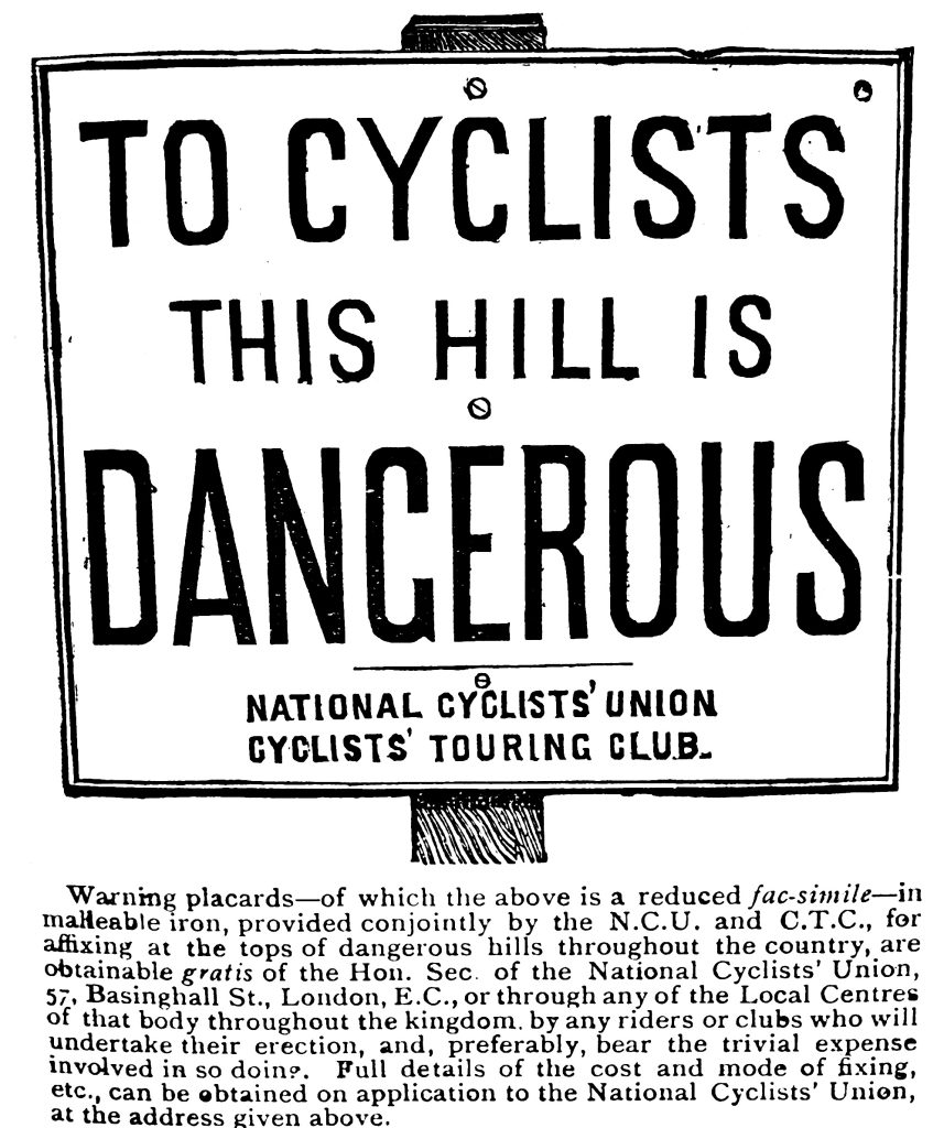
Cast-iron warning signs were erected, from 1883 onwards, by both the CTC and the National Cyclists’ Union, forerunner to today’s British Cycling Federation. Prior to this, local cycling clubs had erected their own ad hoc signs. The CTC and the NCU produced standardised, cast-iron signs. The first signs read: “To Cyclists this hill is Dangerous.”
By 1902, the roads of Britain were dotted with 2,331 “Danger” and 1,989 “Caution” boards.